Decorating With Red Oak Floors
 By Levis4Floors | September 9, 2016
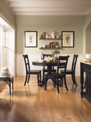

Red oak is perhaps one of the most popular flooring choices in American homes. Red oak can have several color variations that can appear dark brown, tan or even a slight pinkish. The distinct coloring can leave homeowners confused as to what kind of decorating scheme they should do that would complement the space.
While decorating a room with red oak floors requires some creativity you aren’t limited with options. It’s important to use complementary or analogous color schemes with red oak variant flooring.
Complementary Colors
When selecting furniture and wall colors with existing flooring it’s always best to select complementary colors. Complementary colors are the exact opposite of one another on a standard color wheel. If your red oak flooring is infused with shades of brown or red you might consider using shades of green, cream or blue. Using complementary colors in your decorating scheme can create a striking effect. Complementary colors when placed beside each other can make an entire room come alive.
Analogous Colors
Analogous colors are located right next to each other the color wheel. For instance, red, yellow and orange are just a few examples of analogous colors. Using such colors in a space red oak flooring would build on the existing palette. Therefore, when decorating you can choose colors that have warm tones such as orange, brown, red and gold. Analogous colors will give a room a subtle effect as opposed to complimentary coloring schemes. They work best in traditional and formally designed homes. If you want a room that’s warm and cozy then analogous colors are the best to use.
Be sure to consider the size of the wall before selecting a coloring scheme. Warm colors contract visually so using analogous colors can make a small room appear smaller. On the other hand, cool colors open up a space. So you might want to utilize complementary colors.